Hey there students! Welcome to the world of statistics. You might think it’s a complicated subject, but fear not – we’re here to break it down into manageable chunks so you can master the art of analyzing data and making sense of graphs and charts. Let’s get started on this statistical journey!
What Is Statistics?
Statistics is like a superpower for understanding the world around us. It’s all about collecting, organizing, and interpreting data. Data is just information – numbers, facts, or figures – that helps us understand real-world situations better.
Why Do We Need Statistics?
Statistics helps us answer important questions. Have you ever wondered:
– How many students in your class prefer pizza over burgers?
– What’s the average income in your city?
– How does the temperature change throughout the year in your region?
Statistics can help us find answers to these questions and make informed decisions.
Collecting Data
The first step in statistics is collecting data. It’s like gathering puzzle pieces to solve a mystery. You can collect data through surveys, experiments, observations, or by looking at existing records.
Organizing Data
Data can be messy, like a jumble of puzzle pieces. That’s where organization comes in. You can arrange data in tables, lists, or spreadsheets to make it easier to work with.
Graphs and Charts: Visualizing Data
Graphs and charts are like magic tools in statistics. They help turn boring numbers into visual stories. Here are some common types:
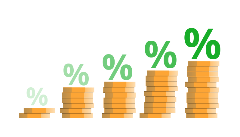
– Bar Charts: These show how different categories compare. They use bars to represent the data, and the height of each bar tells you how much of something there is.
– Line Graphs: These are great for showing how things change over time. Think of tracking temperature over the seasons – the line goes up and down, showing the changes.
– Pie Charts: These are like a tasty pie divided into slices. Each slice represents a part of the whole, like the percentage of people who like different ice cream flavors.
– Scatter Plots: They show how two variables are related. Imagine comparing how hours of study affect exam scores. Each point on the graph represents a student’s data.
Interpreting Graphs and Charts
To interpret a graph or chart, look for patterns, trends, and relationships. Ask yourself questions like:
– What’s the main idea the graph is trying to tell me?
– Are there any spikes or dips in the data?
– Is there a connection between two variables in a scatter plot?
Measures of Central Tendency
Statistics also involves measures like the mean, median, and mode. They help you understand the center of your data:
– Mean: The average of all the data points.
– Median: The middle value when data is arranged from lowest to highest.
– Mode: The value that appears most frequently.
Inferential Statistics
This is where we make predictions and generalizations from a sample of data to a whole population. It’s like saying, “If most of the people in my sample like apples, maybe most people in the world do too.”
Dive deeper into learning about statistics herehttps://blog.maths.ai/statistics-a-complete-guide-with-examples-and-methods/
In Conclusion
Statistics is a powerful tool for understanding the world and making informed decisions. Whether you’re analyzing survey results, studying trends, or making predictions, statistics is all about finding patterns and telling a story through data. So, embrace the world of statistics, and you’ll be equipped to tackle real-world challenges with confidence!